Colorado Speech & Language
MOBILE-FIRST WEBSITE
Helping Denver families conveniently access quality private speech/language services and helpful information pertaining to their child or loved one’s communication needs.

ROLES
-
UX Researcher
-
UI/UX Designer
-
IxD Designer
-
Brand Designer
DELIVERABLES
-
User interviews
-
Competitive analysis
-
Persona discovery
-
Task and user flows
-
Site mapping
-
Wireframing and testing
-
Responsive web design
-
High-fidelity prototypes
SPECS
-
Figma
-
Miro
-
Whimsical
-
Zoom


1. Research

PROJECT BACKGROUND

Colorado Speech & Language is a business based in Denver, CO that provides in-home comprehensive speech and language therapy services.
They specialize in evaluating and treating individuals who are non-speaking/limitedly speaking who utilize augmentative alternative communication (AAC).
The website also provides a multitude of resources for families of children or loved ones with limited speaking capabilities.
User Research
RESEARCH OBJECTIVES
-
Determine the target audience's preferences, needs, and pain points when it comes to finding the appropriate private speech/language services for their child or loved one.
-
Determine what information about a business would be helpful when deciding whether to book an appointment for their child.
-
Determine what kinds of resources families are looking for when working with their child or loved one at home.

RESEARCH PARTICIPANTS


-
5 female, 1 male
-
4 participants have children who are currently in speech therapy
-
All 6 participants have gone through the process of finding speech therapy for their child

3 interviews (Zoom)
I set aside 30min to interview each participant. I recorded each session so that I could go back and review body language, etc.

3 completed surveys (google forms)
A common theme with my interviewees was they were all very busy getting ready for the upcoming school year so I opted for a survey that they could complete on their own time.
Research Synthesis
AFFINITY MAP
I used an affinity map to sort out my participants' answers. Common themes emerged, allowing me to define my user personas.

Based on the affinity maps, the following key insights were deemed useful to include on the website from the participants.
Resources
Testimonials
Easy access to phone number
Insurance affiliates
Clinician information/credentials
Advertise in-home therapy since it was an overwhelming preference
List of services/specialties
COMPETITIVE ANALYSIS
A competitive analysis was conducted in order to see what other speech/language clinics are including on their websites to give me more ideas and to determine the need for additional questions for my research participants.
FEATURE ANALYSIS

Based on the feature analysis, I found some areas that would create a competitive edge.

A more detailed feature analysis was conducted in order to stay aligned with the MVP.

PERSONAS

Cynthia,
the perfectionistic planner

Meredith,
the on-the-go mother of four
GOALS/NEEDS
-
She is in search of the perfect in-home therapy for her daughter who has just been diagnosed with Autism Spectrum Disorder (ASD).
-
She wants to find a qualified speech/language therapy clinic that specializes in social language delays.
-
She would like helpful resources explaining ASD and ways she can help her daughter at home.
She wants to know if there are additional community resources out there such as summer camps or support groups for her daughter and/or herself.
CHALLENGES
-
She came upon Colorado Speech & Language’s website through a google search but she can’t determine whether they provide services for children with ASD.
-
She is having a difficult time finding the contact information for the clinic.
-
She found resources regarding social language therapy but the link takes her to therapy materials for speech/language pathologists, not parents.
GOALS/NEEDS
-
One of her children is 8 years old and non-verbal. She needs to find a private practice that specializes in providing evaluations and access to funding so her son can acquire a communication device.
-
She wants to find in-home, specialized speech/language services for her son.
-
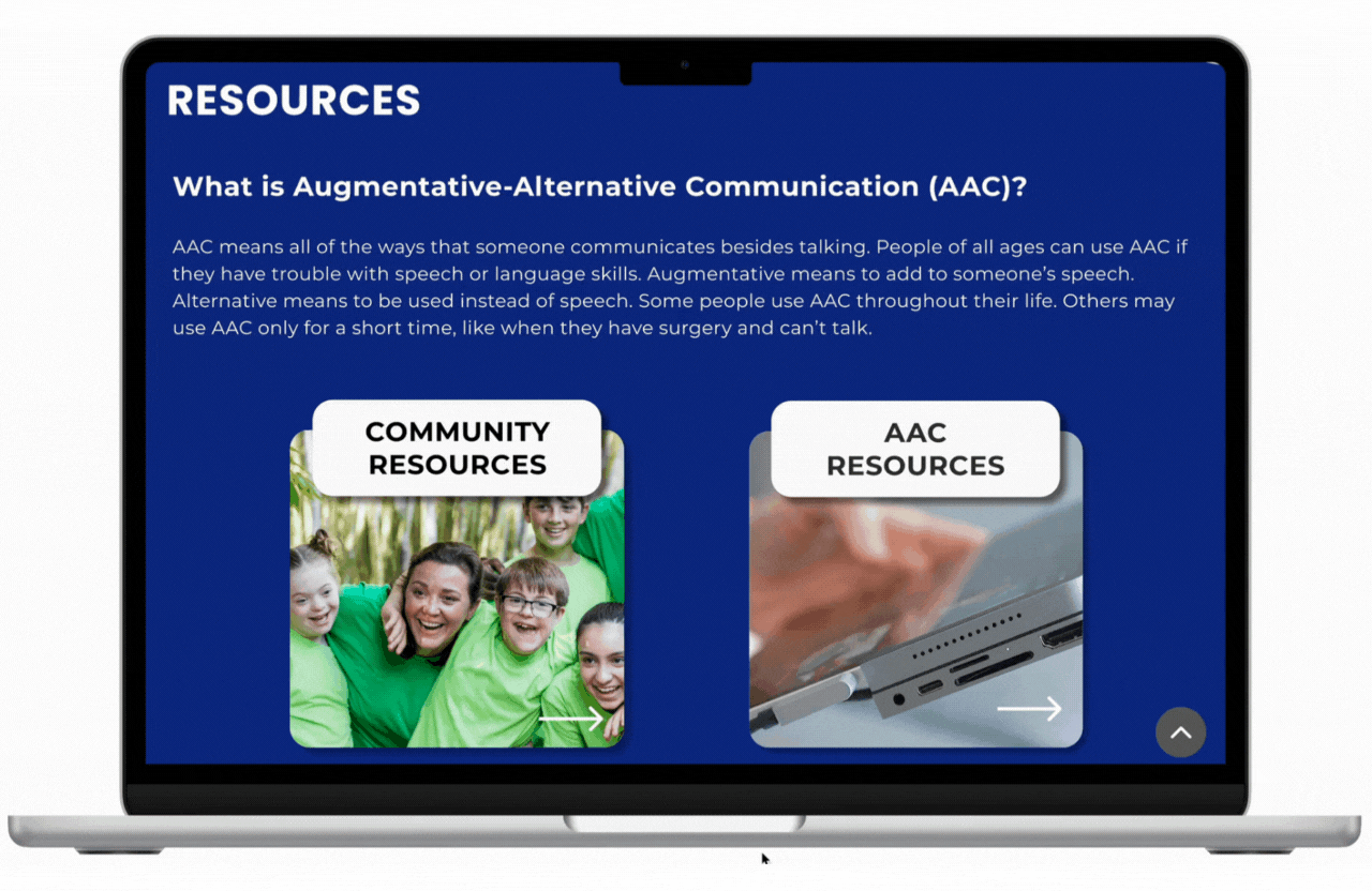
She is in need of some resources explaining what Augmentative-Alternative Communication (AAC) is and how to best support her sons needs at home.
CHALLENGES
-
She heard through other parents that Colorado Speech & Language was a wonderful business for speech/language services, but she can’t find the contact page on the website and doesn’t know how to schedule an appointment.
-
She doesn’t have access to consistent transportation
-
She wants to know whether Colorado Speech & Language is affiliated with her insurance so she knows what to expect to pay, but there is no information on the website.
She is having a difficult time finding resources on the website that apply to parents of children with special needs.
2. Information Architecture
Based on the user interviews and the results of the surveys, a complete revamp of the website was required to meet users' needs.
When creating the IA, a sitemap was used to organize the new and current pages of the site.
Sitemap

3. Interaction Design (IxD)
IxD Deliverables
Task flows
.png)

User flows
Wireframes


4. Branding & Visual Design
As I conducted research (both quantitative and qualitative), I learned that to make Colorado Speech & Language feel like a desirable and quality company, I needed to highlight our core values - comprehensive, empathetic, family-centered, and qualified.
Style Tile

5. Prototyping & Usability Testing

High-Fidelity Prototype
Usability Testing
The high-fidelity prototype was used in usability testing to validate individual design decisions and to determine the need for iterations. During each testing session via Zoom, I was careful to monitor the time it took to complete a task, paying close attention to body language and facial expressions. I encouraged each participant to talk through each task and provide feedback and ask questions.
FEEDBACK PRIORITIZATION
I took the feedback from the usability testing and organized it into a feedback grid and then used a prioritization matrix to determine what changes should be made in order to stay on target with my MVP.
The following frequent and severe patterns emerged that required iteration:
Users were having a difficult time determining whether Colorado Speech & Language provided the right services for their child.
Users revealed they were confused as to the location of the clinic and to emphasize the in-home services.
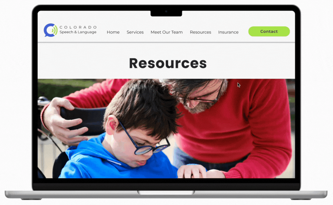
The overall design of the side menu bar on the Resources page was “off, like it doesn’t belong there.”
Users expressed confusion as to whether these were buttons or only cards.
FIRST MAJOR IMPROVEMENT
Users were having a difficult time determining whether Colorado Speech & Language provided the right services for their child.
Users also revealed they were confused as to the location of the clinic and to emphasize the in-home services.
Original Design
Improved Design


Emphasized in-home services
Provided a more detailed list of services
I also added a Services page to create a better user experience.

SECOND MAJOR IMPROVEMENT
The overall design of the side menu bar on the Resources page was “off, like it doesn’t belong there.”
Original Designs


Further testing revealed that a horizontal layout was still “distracting.”
Improved Design
THIRD MAJOR IMPROVEMENT
Users expressed confusion as to whether the resources were buttons or cards.
Original Design

Improved Design
The new cards include an arrow and a hover color changing variant to indicate that clicking it will take you to the intended resource.